
Did Someone Say “Beige Is Dead”?
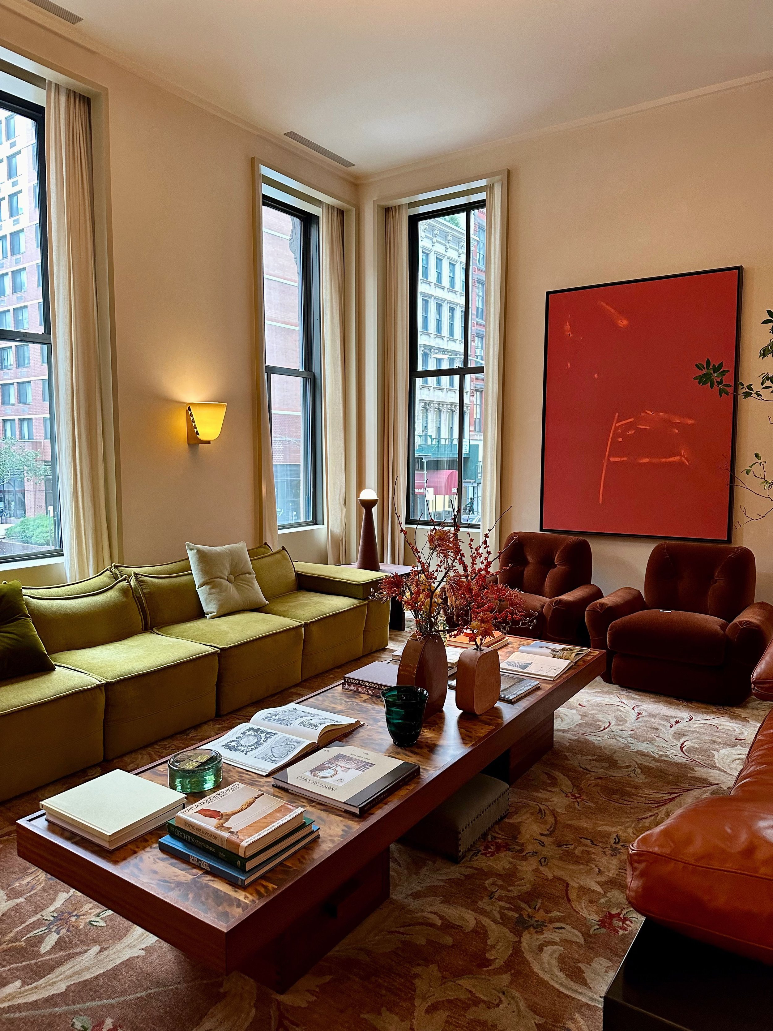
Beige had a good run. For a while, it seemed like every room, outfit, and Pinterest board was some combination of oatmeal, cream, taupe, and “warm white.” Everything was neutral, everything was quiet, and everything was supposed to look effortlessly expensive.
Not anymore! ❤️🔥
Colorful home decor is back, and we think that’s a very good thing. Not because everyone suddenly needs to paint their walls cobalt blue or buy a lime green sofa, but because color makes a space feel personal. It tells you something about the person who lives there. The same goes for getting dressed.
The trick is knowing how to use color so your home feels collected rather than chaotic. Here’s how to bring more of it into your space, your wardrobe, and your everyday life without feeling like you need to become a maximalist overnight.
Why are we suddenly so tired of beige?
There’s nothing inherently wrong with a neutral room. A good cream sofa, an old oak table, or a pair of brown leather chairs can be beautiful! The problem is when neutral becomes the entire personality of a room. 🙄
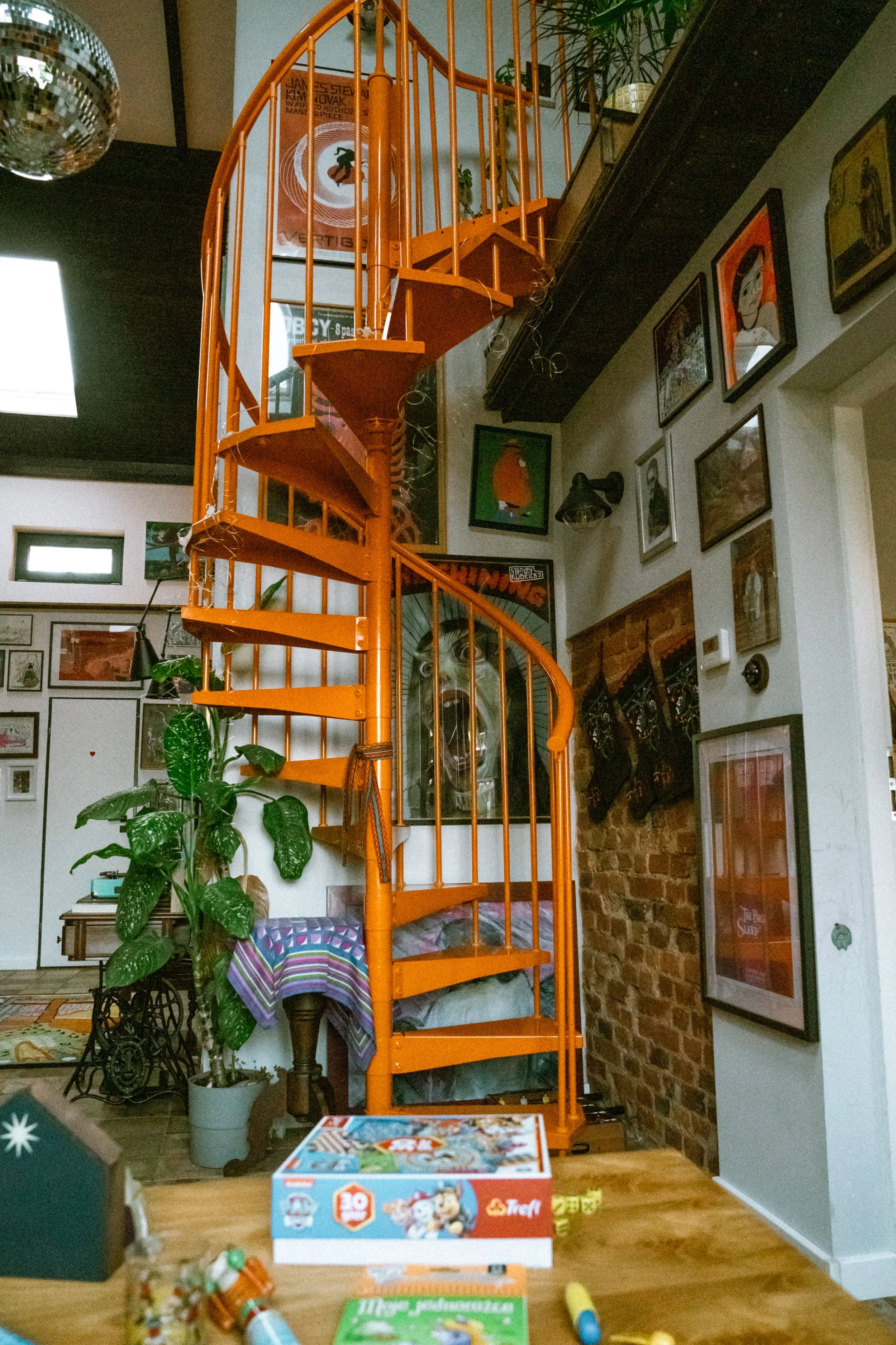
After years of minimalist interiors and extremely coordinated spaces, people are craving things that feel a little more lived-in. A room with a strange lamp, a red chair, a patterned rug, a stack of art books, and something you found at an estate sale tells a much more interesting story than a room where every piece came from the same collection.
The same shift is happening in fashion. Instead of building an entire wardrobe around black, white, denim, and beige, people are reaching for red sweaters, colorful vintage jackets, patterned skirts, bright accessories, and other unexpected combinations.
It’s less about following a new trend and more about letting your taste actually shine!
Start with one color you actually love
If your home is currently 90% neutral, you do not need to overhaul it.
Start with a color you already gravitate toward.
Maybe it's tomato red. Maybe it's butter yellow, forest green, cobalt, lavender, orange, or an oddly specific shade of blue you can't stop thinking about?! Look at your closet, your saved photos, your favorite artwork, or even the things you naturally pick up when you're shopping. There is probably a color story hiding in there already. 👌🏼
Once you identify it, introduce it in a few different ways.
A red vase can become a red pillow, which can become a tiny bit of red in a painting across the room. You don't need everything to match. You just want the color to have somewhere to travel.
That repetition is what makes a colorful room feel cohesive.
Think in relationships, not matching sets
One of the easiest ways to make color feel intentional without making your home look overly coordinated is to stop thinking about matching and start thinking about relationships.
Colors that sit near each other on the color wheel, like blue and green or orange and red, tend to feel naturally harmonious. Colors opposite each other, like blue and orange or purple and yellow, create more contrast.

You don't need to memorize color theory to use this.
Instead, try pairing:
Cobalt blue + warm red
Butter yellow + chocolate brown
Forest green + dusty pink
Orange + deep burgundy
Lavender + olive
Red + pale blue
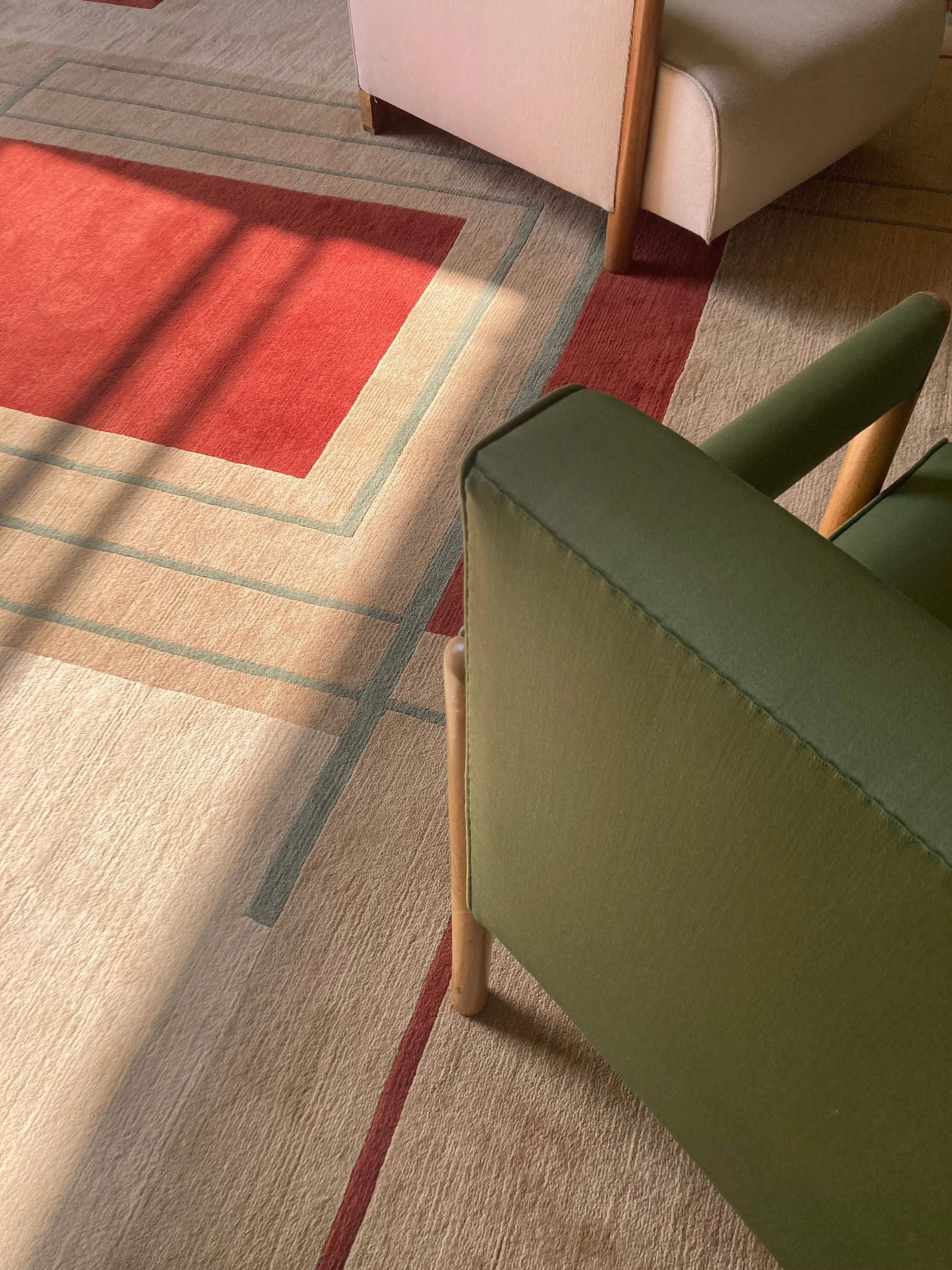
Then soften the combination with materials rather than more neutral color. A worn rug, aged wood, leather, brass, linen, or ceramic can give bright colors somewhere to land.
This is also where vintage pieces really shine. Something doesn't have to be perfectly coordinated to work. In fact, a little tension between colors, eras, and materials is often what makes a room interesting.
Use color in unexpected places
Paint is not the only way to add color! 🎨
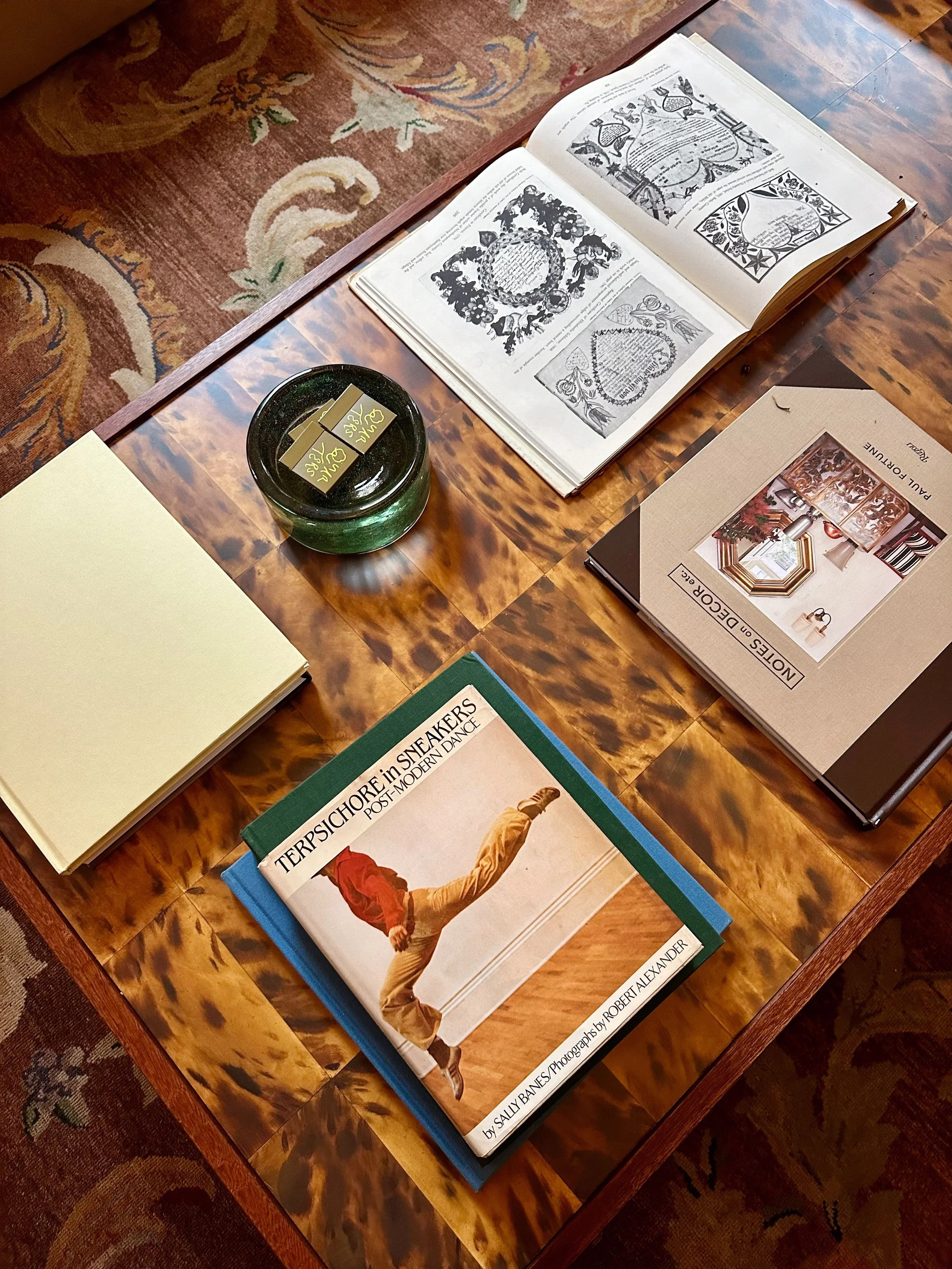
Look at the things in your home that you might normally overlook: lampshades, books, frames, ceramics, curtains, rugs, side tables, artwork, bedding, and even the inside of a cabinet.
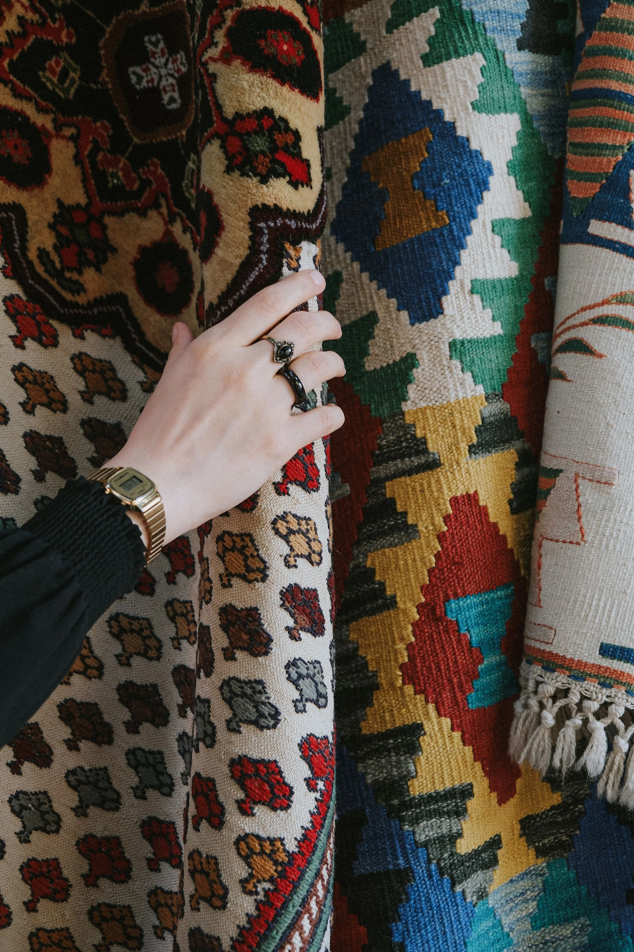
A colorful vintage lamp can completely change a corner of a room. A patterned rug can establish an entire color palette. A stack of old books can add little hits of color without requiring you to commit to anything permanent.
This is one reason we love vintage shopping. You can find things that don't necessarily look like everything else on the market right now.
And those are often the pieces that make a room feel like yours!
Think in relationships, not matching sets
The easiest way to understand color in interiors might actually be to look at your closet.
Think about an outfit you love. Chances are, there is something happening beyond “these colors match.” Maybe you paired a bright vintage skirt with a faded sweatshirt. Maybe you wore a red shoe with an otherwise neutral outfit. Maybe your favorite jacket is a strange shade of green that somehow works with absolutely everything.
Your home can work the same way!!
Start by choosing a hero color and let everything else support it. If you love a bright red vintage coat, you don't need a red wardrobe. You could pair it with denim, brown leather, cream, navy, or even another unexpected color.
The same principle works in a room. One loud piece doesn't need to be surrounded by beige to make sense.
The 60-30-10 rule is a starting point, not a law
You've probably heard some version of the 60-30-10 decorating rule: 60% dominant color, 30% secondary color, and 10% accent color.
It's useful. It is also not a requirement.
Think of it as a way to understand proportion rather than a formula you have to follow.
If you're new to color, try giving one color most of the visual weight, another color a supporting role, and a third color a smaller moment. Once you're comfortable, break the rule.
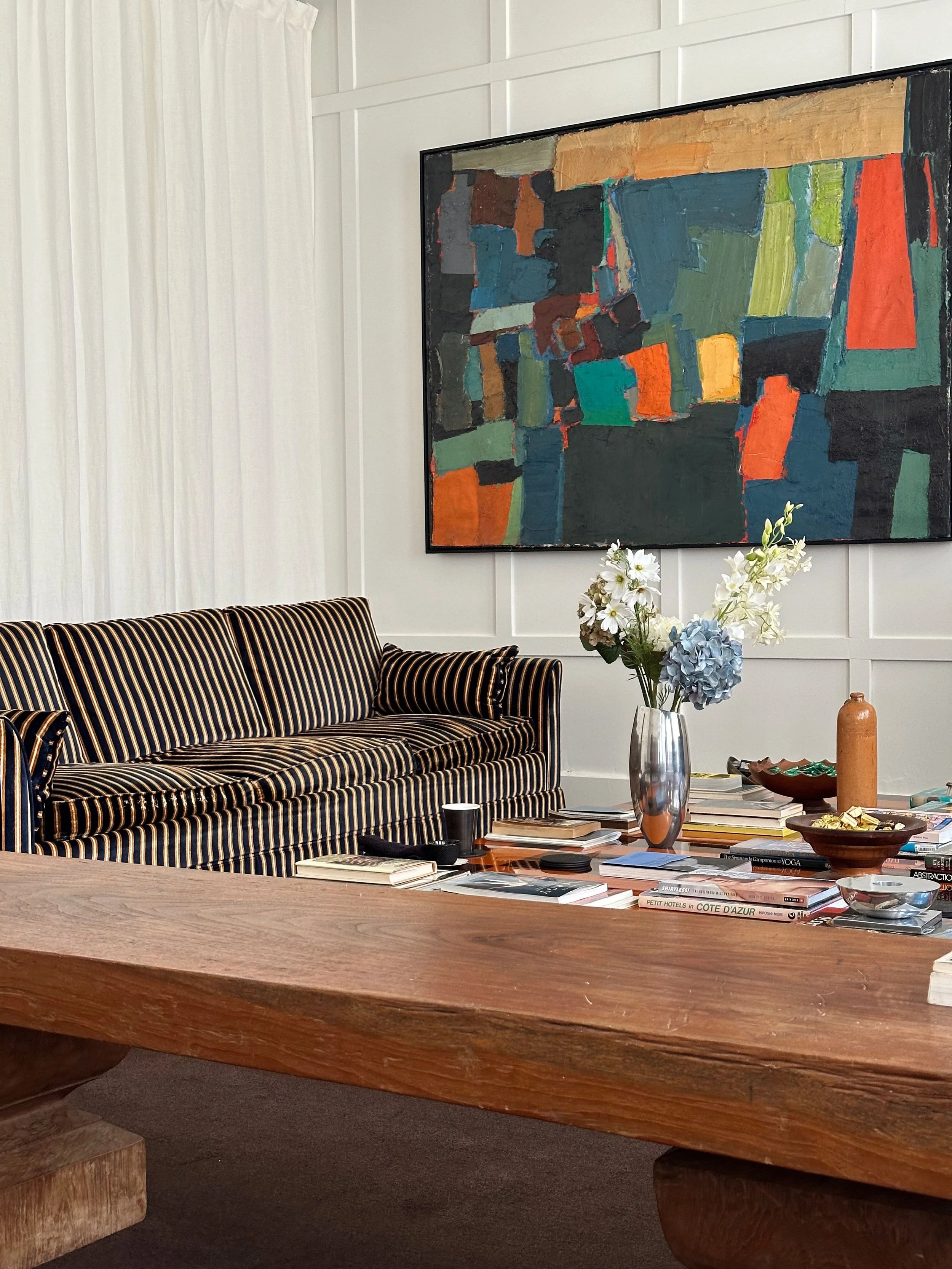
Maybe your room is mostly blue with several shades of green, a little red, and a patterned rug that introduces four colors at once. That is okay!!
The goal isn't mathematical balance. The goal is visual balance.
Let things look collected
This might be the most important part. 👀
A colorful room shouldn't look like you went shopping for “colorful room decor” and bought twelve things in one afternoon 😉 The best spaces usually feel like they happened over time.
That's where secondhand shopping has an advantage.
Instead of searching for the exact shade of green to complete your room, find the weird green chair you actually love. Instead of buying a new matching set of frames, collect different ones. Let your artwork disagree with your rug a little. Put a modern piece next to something from the 1970s.
When everything is slightly unexpected, the room starts to feel collected instead of decorated.
That same idea is at the heart of our guide on ➡️ How to Mix Eras When Designing a Room. You don't need every piece to belong to the same decade or aesthetic to make a space feel pulled together.
Color doesn’t have to mean maximalism
If the word “color” immediately makes you picture a room covered in patterns from floor to ceiling, take a breath.
You can have a colorful home and still love restraint.
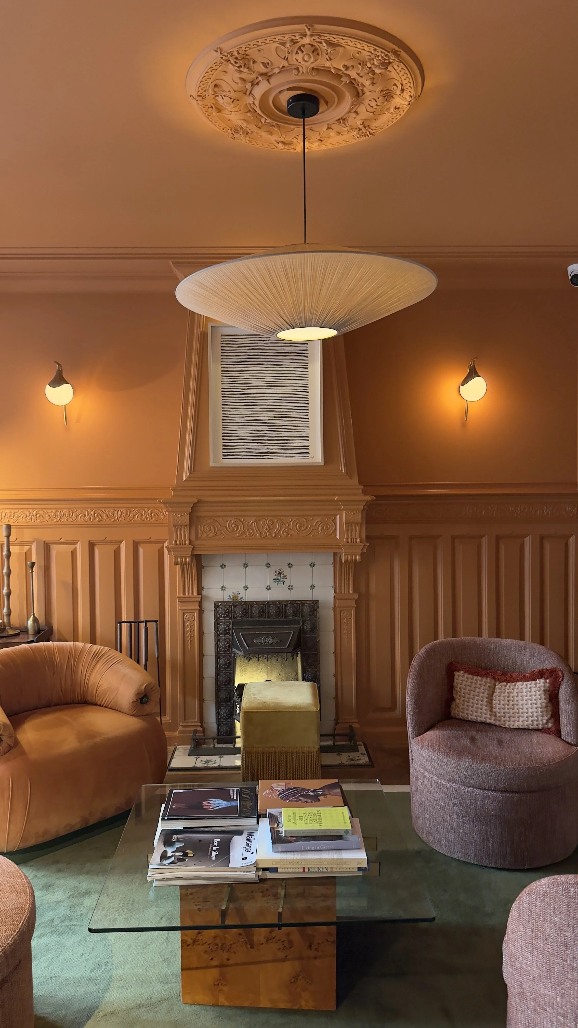
Try one colorful chair in an otherwise simple room. Hang a single oversized painting above a neutral sofa. Put a patterned vintage rug in a room with simple furniture. Add a bright lamp to a quiet corner.
Or start even smaller.
One object you really love is enough.
The point isn't to eliminate neutrals. It's to stop letting them make every decision for you!
So, what should you actually look for?
The next time you're shopping for your home or wardrobe, don't ask yourself, “Does this go with everything?”
Ask:
“Do I love this?”
Then:
What color is it?
What other colors could I pair it with?
Is there a color already in my home or closet that could connect to it?
Does the material or texture add something beyond the color?
Would this still be interesting to me if it weren't currently trending?
Am I buying it because it feels like me, or because I think it is what my space is supposed to look like?
That last question is a big one ⬆️
Color is back, Make it yours!
Beige isn't going anywhere, and it doesn't need to. Neutral pieces are useful. They create contrast! They give your eye somewhere to rest.
We're just making room for everything else again.
The red chair. The weird blue lamp. The floral jacket. The orange ceramic. The rug that somehow contains six colors you never thought to put together. 🙃
Color makes room for personality.
So the next time you're tempted to buy the beige version because it's easier to style, maybe don't. 😎
Come see what we have on the floor at Artifact. You might find the piece you didn't know your home was missing!